ARTIST | BIOGRAPHY | ESSAY
I’M COMING OUT
By Tom Everhart
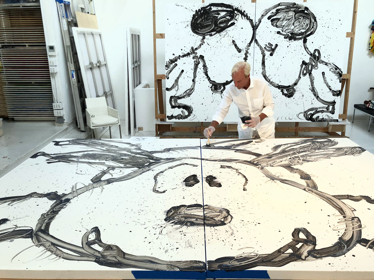
Tom Everhart in progress with Have Mercy.
I usually work in a direction until I know how to do it, then I stop. At the time that I am bored or understand — I use those words interchangeably — another appetite has formed. A lot of people try to think up ideas. I’m not one. I’d rather accept the irresistible possibilities of what I can’t ignore.
-Robert Rauschenberg
So, if you have gone to an art show, hung in a hip 1970s Italian clothing store (Fiorucci), with a new friend who has decided to run through the show with one of his own fresh wet paintings, smearing its sticky paint on all the store’s clothing, screaming, “I’m an artist too, I’m an artist too,” what do you do? (Not to mention, who can’t resist the aromatic toxic perfume of turpentine soaked polyester).
A. Help Stop It?
B. Run Out?
C. Hide behind a mannequin, and hope that no one will know immediately whom you are with?
Personally, I’d pick the camouflage of the mannequin, allowing a larger audience to eventually interact with.

UPTOWN ART LADY BUBBLE BATH, 2017, Acrylic, Enamel and Varnish on canvas, 84 x 54 INCHES
It was the turning of the decades from the 1970s into the 1980s, and I had been just recently fully released from a long run of utopian art academia. This was my introduction to the streets and galleries of New York.

ANDY’S TSUNAMI (ANDY WARHOL), 2016, Acrylic, Enamel and Varnish on canvas, 84 x 192 INCHES
CUBE’S SOUND WAVE (ICE CUBE), 2016, Acrylic, Enamel and Varnish on canvas, 84 x 64 INCHES
A few days later, I awoke, on a friend’s studio couch to the chants of, “we’re going piecing, we’re going piecing.” Piecing was the term for when a graffiti artist produces an artwork. Of course, I never would have considered myself a graffiti artist, but I did appropriate their tools, and especially the grand scale. My screaming new friend, Jean-Michel Basquiat, and his collaborator, Al Diaz’s literary-graffiti would eventually be put directly in the face of the New York art world.
Most importantly, graffiti was much more of a public art, and therefore, could reach a broader audience than those of the galleries.
But, what would explain all of this mischievous reckless behavior?
Maybe, it was the critics premature burial of painting, in the 1960’s. Or, maybe it was the long reign of minimalism that persuaded the art world to call into question the medium’s continued viability in 1979. Moreover, the sense of egoism that had pushed and pushed minimalism to the point of solely academic, dramatically reducing the size of a viewing audience. It became an intimidating, secret language that few could understand.
But, the spectator was important. As Marcel Duchamp had said, “the artist performs only one part of the creative process. The onlooker completes it and it is the onlooker who has the last word.”
You might say that within this pivotal moment in time, we all became pluralist, searching in a variety of sources both inside and outside art. Through several strategies of appropriation of painting, clear conscious references to earlier painterly art styles and the human touch of the artist marks were often explored. The appropriation from non-art sources would offer the opportunity to work with a pre-existing series of universal languages like portraiture, landscapes, still lifes, and … cartoons.

BITCH PLEASE, 2017, Acrylic, Enamel, Varnish AND POM-POMS on canvas, 84 x 128 INCHES
This combination of recognizable subjective visual object matter and painterly process not only encouraged a much broader audience, outside of a small contemporary art world, but also, could provide a much-desired device of “camouflage.” This subversive method of camouflage allowed the narrative of one’s sociopolitical feelings and personalized sensibilities to blend into the forest of recognizable imagery, without first losing the onlooker through an immediate visual content.
Even Picasso, decades earlier, attributed Cubism to camouflage; “a device of misrepresentations, a deconstructive tool designed to undermine the certainty of appearances.”
And, the work of a few artists, like, Philip Guston, had laid the groundwork for this “Imagistic painting style,” conjoining picture and painterly process. In risking his fully developed career, in the late 1960’s and 1970’s, he rejected his well-respected Abstract Expressionism for a more figurative cartoonish imagery that offered a narrative for his social comment.
In retrospect, thinking from this period would define my work to follow.
In the winter of 1980, Keith Haring, with a big black marker, started to draw graffiti on the streets; in the summer, Philip Guston died; and a very short time later, I met Charles M. Schulz (Sparky), in his Santa Rosa studio.
As a “Painter,” meeting a “Cartoonist,” it was his “line,” not his “storyline” that captured the way I see. Amazingly, for the next twenty years of our friendship, it was predominantly discussions on the expressive qualities and exaggerations of human emotions and activities created though minimalized black-line construction.
I was completely overwhelmed.
It made me understand everything from my recent art academia years about line. In Rheta Grimsley Johnson’s biography, Good Grief, 1989, Sparky states: “the drawing within a comic strip is more important than the writing. It is what makes a cartoonist a cartoonist.”
Just as compelling, were the ongoing discussions of the simplification of his pictorial space, as he flattened and minimalized his forms, rejecting traditional perspective for a more naïve presentation of space. He also mentions in Johnson’s biography, “perspective and detail become unimportant if the reader knows a table is a table and that table is funny to look at.”
As Sparky would write in, A Golden Celebration, 1999, “it took on a quality, which I think is even more important, and that is one which I can describe only as abstraction.”
I was quickly becoming bored and was not learning from my own painting formula, which ranged from skeletons to deconstructed gardens, “another appetite had formed.” But, it would be eight years into our friendship before I would begin the Schulz-related work.
Eight years to start one concept?
Well, there was the “stipulation” and the “risk.”
During those first eight years, we sometimes discussed the possibility of a new body of my paintings formulated on the influence of his strategies of line and space. It felt inevitable and appropriate. Incredibly, there was really only one stipulation that we both felt most importantly essential.
It was this: the body of paintings could not be based on how he sees the world. It had to be a new way of seeing the same thing. It had to be the way I see the world. I knew exactly what this meant. It meant: no character self-representations, themes, or storylines from his strip’s (his) thinking.
Also, in Johnson’s, Good Grief, Sparky states that, “the good artist looks at the same thing as everybody else and then produces a drawing of something nobody else saw. And, the artist succeeds if he or she can present something familiar from an unfamiliar angle.”
Oh right, and then there was the risk.
A concept of the visual central matter of an entire body of work pulled from one singular and very popular cartoon would offend the notion of taste as it was generally known and accepted in the art world, even among some of the most radical of the avant-garde. It simply didn’t fit their image of what the art of the museums looked like, up until then. It hadn’t been attempted before, and to me it suggested a new way of painting, that would confront the clichés of art and the conventions that have govern how we recognize art as art. Of course, I kept this to myself.

STORMY, 2018, Acrylic, Enamel AND Varnish on canvas, 84 x 192 INCHES
In 1988, how I saw the world and the “risk” completely changed. On Friday August 12th, Jean-Michel dies. And, on Monday August 15th, I did as well, in a completely unexpected ten hour surgery, as I was lately diagnosed with stage four colon/liver cancer. After two months of multiple surgeries, I was given a maximum of two years, including a year of radical chemotherapy.
But I could now see the subject matter and an authentic reason essential to develop the work… “Being alive.”
This was something that I absolutely could “not ignore.”
And, the “risk” of the art world receiving its arrival with shocked incredulity, well, it just didn’t matter anymore. There was also now a much bigger reason for making art than just art world approval. I kept this to myself, as well.
SECURITY BLANKET, 2009, Acrylic, Enamel AND Varnish on PANEL, 36 x 36 X 9 INCHES
For the next thirty years, this collision of usually segregated art forms, painting and cartoon, would be the “perfect camouflage” for the way I see and visually articulate, “the feeling of living.” In order for the work to achieve this feeling, it was essential for it to continuously grow and change. Immediately, I began to incorporate a constant flow of academically derived stylistic painterly shifts that would create the pattern for constant visual growth within the pictorial space.
One of the most challenging aspects, in the beginning of this new work, was visually introducing Sparky’s very familiar art forms as nonrepresentative of themselves. So, this universal language evolved into a humorous camouflage that not only allowed vent for my “living” sensibilities, but as well for sociopolitical attitudes as my actual subject matter.

Woman Please, 2018, Acrylic, Enamel AND Varnish on canvas, 84 x 128 INCHES
The titles were constructed to confirm the camouflage of that subject matter. Similar to that of William Burroughs’s Cut-Ups technique, deconstructing and reconstructing words by alternative spelling and rearranging would direct the work to have a temporary camouflaged subject matter, different from its immediate content, directly in the face of the viewer.
For example, in 2004, the series, See Sick, consisting of forty-six paintings, presented the onlooker with the visual object matter of close-up portraits of Sparky’s characters humorously face deep in rolling water. Due to their exaggerated expressions, one would immediately assume the subject is about being seasick. But, the title offers a semiotic clue to the actual subject matter. The word “sea” in “seasick” has been altered to “see,” to form a new narrative. The subject matter in See Sick was “seeing” the personal and political dissatisfactions that I couldn’t ignore, and how it made me feel “sick.”
With the device of camouflage in Sparky’s influenced imagery, series after series produced an abstraction of my experience “of living.” All of these continually changing series, above all, established a formula of constant growth and a meaningful expression through which the personality of “being alive” is present.
Starting in the early years of my academia, part of my “being alive” had included an interest in the changing conditions of American psyche in the world of politics. This is first most apparent in a series of eighty paintings, under the title of, Slumber Party.
Each work constructed on the visual object matter of exhausted, slumberous expressions of human behavior, felt through the drawing of Sparky’s character imagery. Its suggestiveness is meant to reference the social realities of a state of sedative social consciousness. This camouflage theme would appear in several other future series.
The most obvious is a narrative found in a very recent series, Sleeping Beauties. Its title was created through a reversal of the title of a work from the Slumber Party series, titled, Beauty Sleep. The series Sleeping Beauties, fourteen years later, announces a need to evolve the Slumber Party theme.
The fifty-one paintings in the Sleeping Beauties series, continues Slumber Party by presenting the viewer with its drowsy and nodding conditions of suspended consciousness. The original concept required 50 painting panels to represent the fifty states of America. During their production, one panel was slightly damaged and replaced. But, the panel absolutely proved workable and soon came to represent storm damaged Puerto Rico.
Indeed, I have always been very confused by the burden of America’s sad struggle with gun violence. To change the meaning produced by the pull of humor in each of the shuteye expressions of Sparky’s characters, each panel has been partially titled with a number referencing the order of each state’s entry or ratification into the union.
I guess I just wanted one to dream about “America the Beautiful” finally waking up as the alarm is going off.
The Sleeping Beauties series was part of another series, The Have Mercy Paintings still in progress; The Have Mercy Paintings would grow to include several other series.
The “series” were not just a device of growing but organically grew from one series into the next. Sleeping Beauties was created from the last work in the Bubble Bath series, Sleeping Beauty Bubble Bath. The Bubble Bath series was produced after my bubbles of influences addressed in the Waves of Influence series.
The Waves of Influence series, of over one hundreds works, is void of any political implications. In this series, the onlooker is offered information of the fundamental aspects of the work’s visual formulations and articulation by individually referencing the majority of its influences. Naturally, the Schulz-influence, the common thread, is represented in every work through a wave drawing from Sparky’s strip, dated April 2, 1991. The small-scale character of Snoopy in the surf is only present to over-scale the large influential wave.

Young Brothers And Sisters Please, 2018, Acrylic, Enamel AND Varnish on canvas, 84 x 128 INCHES
A work in the Waves of Influence series, for example Andy’s Tsunami, 2017, a 16 foot gold painting, calls attention to a big influence of a small conversation, at a party, with Andy Warhol. It was the last year of his life, 1987, just a year prior to the start of my Schulz-related work. He knew, through a friend, of my considered concept with Sparky’s imagery. He commented that all new art incorporates some form of appropriation that is “usually borrowed or stolen.” But because this visual information was learned personally from its creator, it was “a different way of seeing the new.” As a young artist, it was very much like an inspirational tsunami.

BIG FATTY, 2005, Acrylic, Enamel AND Varnish on PANEL, 30 X 30 INCHES
Also in the Waves of Influence series, there are references to the music environment in my studio in the Sound Waves paintings. Ice Cube Sound Wave for example, produces an image of the visual sound under the influence of Ice Cube’s music.
In a case of reverse camouflage, Bitch Please, part of the ongoing Have Mercy Paintings, is not so much concerned with pulling in a broader audience, but rather, the much smaller contemporary art circle. The immediate visual content is seemingly void of any recognizable Schulz imagery and appears to be solely concerned with an Abstract Expressionist painting process. As expected, there was a blindly opened-arm welcome from the small circle.
But, within the pictorial space exist two lines constructed of fuzzy pom-pom balls, one pink, and the other black, each beginning with a small yellow dot. These two lines are actually the flight patterns of Sparky’s character of Woodstock. And, the yellow dots are abstracted Woodstocks.
As If I hadn’t annoyed them enough.
It is important to note that, because the work was void of any familiar Schulz imagery, I felt comfortable with the language used in the title. Therefore, it’s actually quite ironic that the title is borrowed from the title of a track by someone named Snoop Dogg.

My Brothers Please, 2018, Acrylic, Enamel AND Varnish on canvas, 54 x 84 INCHES

Brothers and Sisters Please, 2018, Acrylic, Enamel AND Varnish on canvas, 84 x 128 INCHES
Soon to follow, in the Have Mercy Painting series, would be Brothers and Sisters Please, Young Brothers and Sisters Please, My Brother’s Please, Woman Please, Have Mercy, The Partly Cloudy series, and the most recent, Stormy.
The most recent series Partly Cloudy, and Stormy, camouflages through obstructing Tahitian clouds, the difficult to ignore abundance of various new resources and disinformation that clouds the way we see and understand the world.
In the series, Sculptural Tendencies, even the flat surfaces of the work would soon become a vehicle of “growing camouflage.” The only common association in the work was its surface as it became sculptural. This close intertwining of flat and sculptural, created abstractions of Sparky’s forms, that he considered abstractions.
In a very different approach, the titles announced the immediate content of subject matter of this abstractions, such as, Security Blanket.
Only one work presented Sparky’s characters representative of themselves. The Tear, executed shortly after his passing, did represent the character of Snoopy, but, as well, represented anyone who was pained by his death.
On February 12, 2000, the eve of his final published Sunday strip, the 17,897th Peanuts strip, Sparky passed away from the same cancer that, twelve years before, tried to take my living.
I never recovered from his death.
In the years following his absence, new art, using the Peanuts characters and the strip, started to appear around the world, in an “iconic cartoon character Pop Art style.” Pop Art, because they were about the recognizable imagery of the characters only. They had no personal connection to Sparky, the artist.
Shortly after the Louvre exhibition, in 1990, I still seemed to be very much alive, having produced almost fifty large scale works. Sparky felt it was very important that the work should have some protection for the future. So, he and his business representatives arranged a legal agreement that protected me for, “the term of my life.”
I remember being confused, but felt eternally grateful.
Unfortunately, ten years later, the gratitude from that authenticity caused concern that this new “Peanuts Pop Art” could be confused with the authenticity in my own work that was deeply rooted in the strategies of Sparky’s visual articulation.
Please don’t misunderstand; I was excited that other artist were looking at Sparky’s work. But their process went completely against his formula of not incorporating the storylines and characters as representational of themselves, the “stipulation.”
Discouraged and disoriented, for a very short time, I started producing work without the influence of that learned authenticity. Paintings like Big Fatty, presented a large abstracted rolling wave, inspired by a predicted tsunami for the area around my Los Angeles studio. This work included the same Abstract Expressionist approach and construction, although, without Sparky’s recognizable imagery.
The new work was well received within the contemporary art circle, but felt lifeless to me. It looked too safe, ordinary and the “same old thing.” I soon returned dedicated to the original work.
Since then, more Peanuts Pop Art continues, and now quite often, with a more license-oriented angle intended for marketing art banks. I felt it very important to revisit in a series. The reason for continuing the painting: “The authenticity that surrounded and produced it.” Not only would it pay respect to that authenticity, but as well, to his enormous championing of the paintings.
The series would be titled, The Real McCoy. As an idiom and metaphor for “the real thing” or the “genuine article,” it became the most personally important series for me. It consisted of nineteen paintings, one dedicated to each of the twenty years of our friendship, excluding the final year.

Have Mercy, 2018, Acrylic, Enamel AND Varnish on canvas, 84” x 54”
Thirty-eight years ago, Sparky and I first started laughing about the possible concept of conjoining my approach to painting with his approach to drawing and pictorial space. Today, the work and myself are still living and “growing camouflage” in that same open-ended concept that expands the boundaries of painting as living life.
Maybe, enigmatic works of art tend to be more durable than those that readily succumb to define explanation.
In an important quote that I often referred to, in A Golden Celebration, 1999, Sparky writes of the “abstraction style” that grew in his work: “This was the direction I wanted to take, and I believe it has led me to do some things that no one ever attempted in a comic strip.”
Very similarly, the very political choice I made, within a very small art world, to devote an entire body of work, more universally accessible to a broader based audience, central to the ideas of the process and strategies of one single cartoonist, “has led me to do some things that no one ever attempted,” in a painting.
Back in 1980, at the San Francisco Museum of Modern Art’s retrospective of Philip Guston’s paintings, shortly before he died, he is filmed saying, “It’s a painting show, but it’s a life, you know? It’s like a life lived.”
2018